In this post we’ll forecast MRR into the future. We’ll use ChartMougl as the source of data. It’s important to note that ChartMogul does not include MRR from the Android app and is missing some MRR from customers that pay us manually. The MRR values of these customers are low enough to not have a very significant impact on our forecasts.
I’ve exported a CSV containing the MRR values from January 1, 2017 to June 20, 2019. We’ll read it into our R session with the read_csv function.
# read csv
mrr <- read_csv("~/Downloads/cm_mrr.csv")
Let’s plot MRR over time.
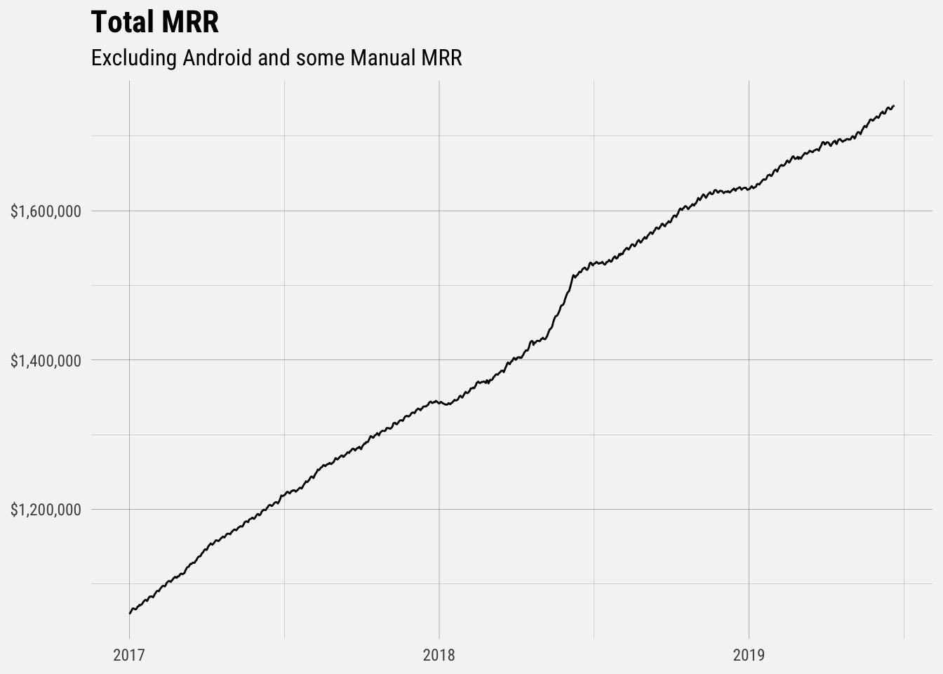
We can see that MRR growth has been roughly linear and includes a couple of interesting inflection points.
Forecasting MRR
We’ll use the prophet package developed by the folks at Facebook to make our basic forecasts. We first need to prep a dataframe with columns ds and y, containing the date and numeric value respectively. The ds column should be YYYY-MM-DD for a date, or YYYY-MM-DD HH:MM:SS for a timestamp. Because of those inflection points, we’ll only use MRR from the past year to make the forecast.
# create dataframe to send to prophet
prophet_df <- mrr %>%
  filter(date >= '2018-06-20') %>%
  rename(ds = date, y = mrr)

# fit model
mod <- prophet(prophet_df)
Predictions are made on a dataframe with a column ds containing the dates for which predictions are to be made. The make_future_dataframe function takes the model object and a number of periods to forecast and produces a suitable dataframe. By default it will also include the historical dates so we can evaluate in-sample fit.
# make future dataframe
future <- make_future_dataframe(mod, periods = 180, freq = "day")
Now we can make the forecasts for the next 180 days and plot the results.
# make predictions
fcast <- predict(mod, future)

# plot results
p <- plot(mod, fcast) +
  scale_y_continuous(labels = dollar) +
  theme_minimal() +
  labs(x = NULL,
       y = NULL,
       title = "Forecasted MRR",
       subtitle = "Excluding Android MRR and Some Manual MRR")

# make interactive plot
ggplotly(p)
The black line represents historic MRR values, and the solid blue line represents our predictions. The light blue band around the predictions represents the upper bound and lower bound of the confidence interval. When you hover over the band, yhat_upper represents the upper bound of the confidence interval and yhat_lower is the lower bound. This is the range of values such that with 95% probability, the range will contain the true MRR value.
We can use the same data to forecast ARR, which is just MRR times 12.
# create dataframe to send to prophet
arr_df <- mrr %>%
  filter(date >= '2018-06-20') %>%
  mutate(arr = mrr * 12) %>%
  rename(ds = date, y = arr)

# fit model
arr_mod <- prophet(arr_df)

# make future dataframe
arr_future <- make_future_dataframe(arr_mod, periods = 180, freq = "day")

# make predictions
fcast <- predict(arr_mod, arr_future)

# plot results
p <- plot(arr_mod, fcast) +
  scale_y_continuous(labels = dollar) +
  theme_minimal() +
  labs(x = NULL,
       y = NULL,
       title = "Forecasted ARR",
       subtitle = "Excluding Android MRR and Some Manual MRR")

# make interactive plot
ggplotly(p)
That’s it for now!