In this analysis we’ll forecast new MRR for the most important plans of the Publish product. We’ll break down the trends in MRR growth into daily, weekly, and yearly seasonality. The table at the end of this analysis includes the daily forecasts for new MRR growth. These are the daily targets that we’re hoping to beat.
Because ChartMogul’s API doesn’t let us filter by plan group, we’ll only forecast new MRR for the most important Publish plans: Pro, Premium, Small Business, Medium Business, Large Business. We’ll collect all of the daily MRR movements since January 1, 2018.
# get mrr movements from chartmogul api
mrr <- get_mrr_metrics(metric = "mrr",
                       start_date = "2018-01-01",
                       end_date = "2019-07-24",
                       interval = "day",
                       plans = plan_names)
## [1] "Getting data from: https://api.chartmogul.com/v1/metrics/mrr"# tidy the data
mrr <- mrr %>%
mutate(new_mrr = `mrr-new-business` + `mrr-reactivation`,
new_mrr = new_mrr / 100,
date = as.Date(date))Let’s look at new + reactivation MRR for Publish over time.
## `geom_smooth()` using formula 'y ~ x'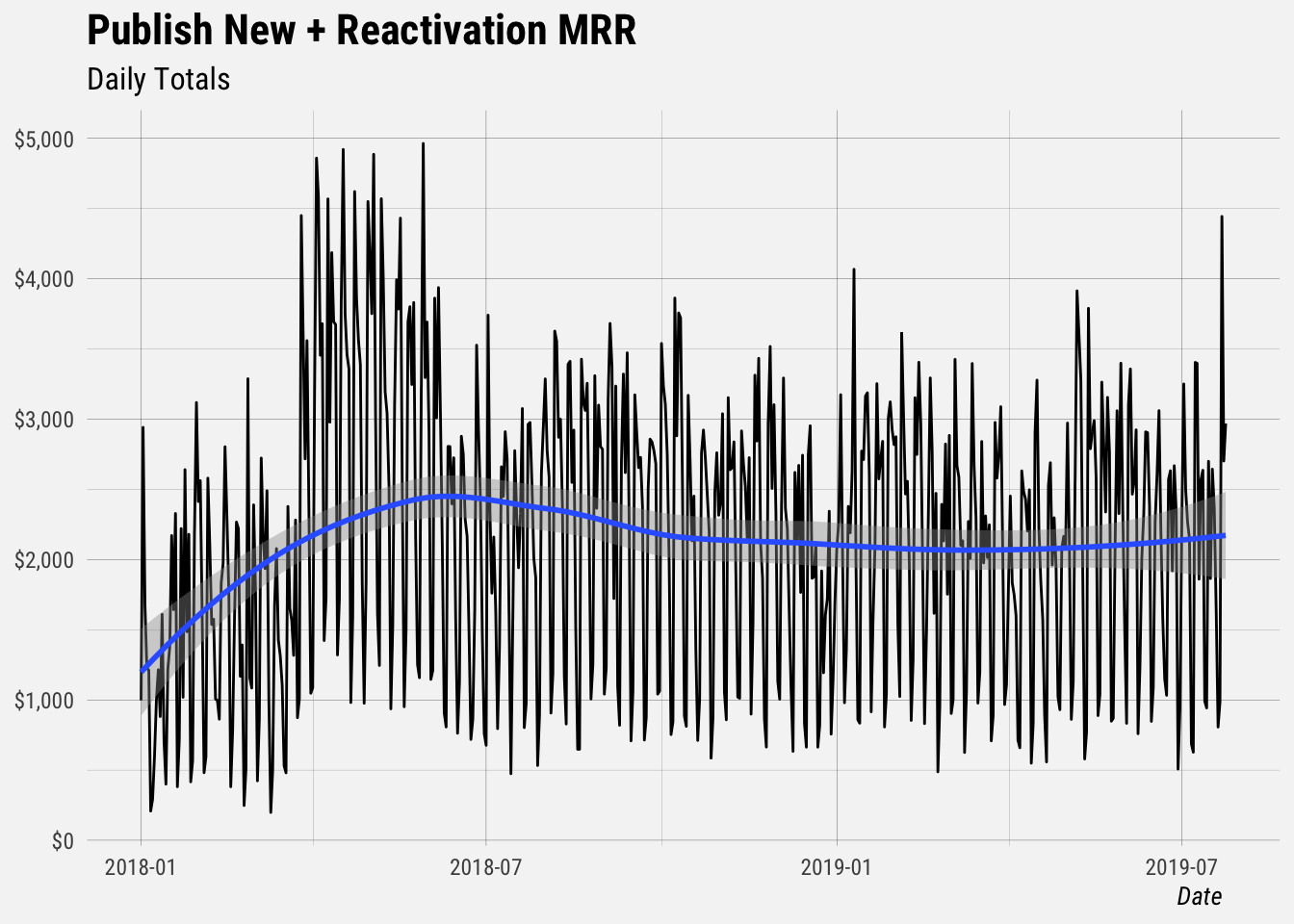
We can see that new + reactivation MRR grows by roughly $2.5k each day, and that it increased by quite a bit in the middle of 2018. What happened then?
Forecasting New MRR
We first need to create a dataframe with columns ds and y, containing the date and numeric value respectively. The ds column should be YYYY-MM-DD for a date, or YYYY-MM-DD HH:MM:SS for a timestamp.
# filter  mrr to give us data we want
new_mrr <- mrr %>%
  dplyr::select(date, new_mrr)

# create dataframe to send to prophet
prophet_df <- new_mrr %>%
  rename(ds = date, y = new_mrr)

# fit model
mod <- prophet(prophet_df, weekly.seasonality = TRUE, yearly.seasonality = TRUE)
Predictions are made on a dataframe with a column ds containing the dates for which predictions are to be made. The make_future_dataframe function takes the model object and a number of periods to forecast and produces a suitable dataframe. By default it will also include the historical dates so we can evaluate in-sample fit.
# make future dataframe
future <- make_future_dataframe(mod, periods = 60)
Now let’s make the forecast and plot the results.
# make predictions
fcast <- predict(mod, future)

# plot results
plot(mod, fcast) +
  scale_y_continuous(labels = dollar) +
  buffer_theme() +
  labs(x = NULL,
       y = NULL,
       title = "Forecasted New New MRR Growth",
       subtitle = "New + Reactivation MRR")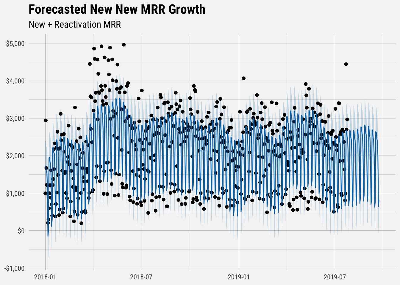
The solid blue line represents the forecast’s predicted value. The biggest source of uncertainty in the forecast is the potential for future trend changes, so the furthest months forecasted for have the highest risk of being off.
We can also plot the seasonal decomposition of the forecast.
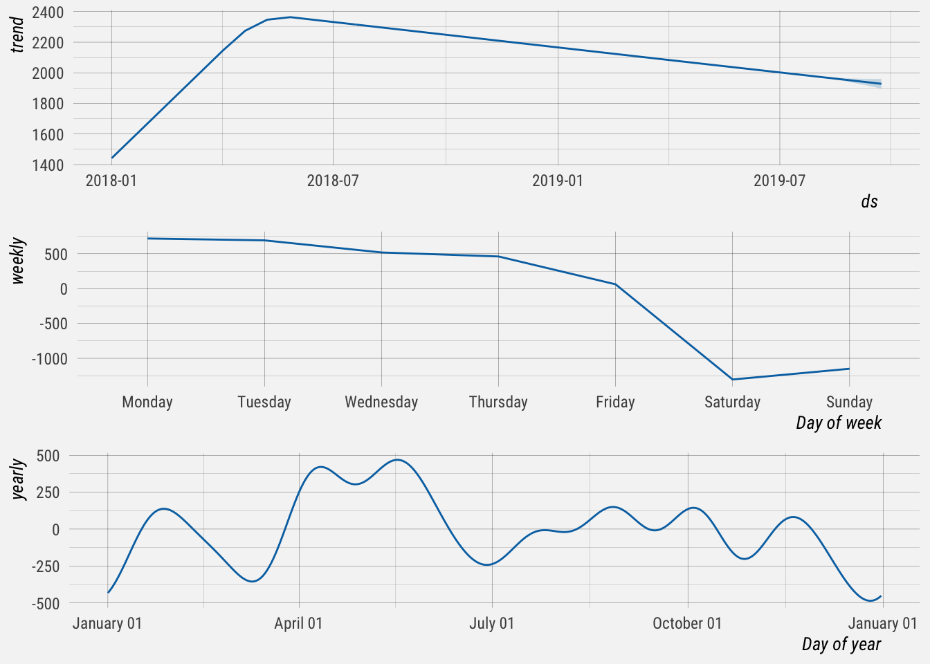
## NULLThis graph is informative. The first panel indicates an overall negative trend in new MRR growth. Interestingly, this trend started decreasing in mid 2018.
The second panel shows weekly seasonality. New MRR growth tends to be highest on Monday and Tuesday, and falls off for the rest of the week.
The last panel shows the yearly seasonal component. We have to keep in mind that we only have data from January 2018, so less than two years of data were used to come up with an estimate of yearly seasonality. It shows that new MRR tends to increase in January, April and May, before dipping in July. It then gradually picks up in the fall before falling at the end of the year.
Forecasted Values
Let’s get the forecasted values and the confidence intervals for new MRR. The upper_bound and lower_bound represent the uncertainty interval, which is based on the variance between historic dates You can see that most of the black dots in the plot above fall within this uncertainty interval.
| day | forecast | lower_bound | upper_bound |
|---|---|---|---|
| 2019-07-25 | $2,434.46 | $1,817.30 | $3,089.78 |
| 2019-07-26 | $2,034.56 | $1,412.79 | $2,697.38 |
| 2019-07-27 | $667.99 | -$66.64 | $1,317.29 |
| 2019-07-28 | $820.40 | $170.22 | $1,511.78 |
| 2019-07-29 | $2,686.45 | $1,994.02 | $3,365.46 |
| 2019-07-30 | $2,656.89 | $2,002.30 | $3,311.13 |
| 2019-07-31 | $2,480.34 | $1,800.47 | $3,150.37 |
| 2019-08-01 | $2,419.62 | $1,758.14 | $3,069.54 |
| 2019-08-02 | $2,017.33 | $1,361.30 | $2,696.63 |
| 2019-08-03 | $649.79 | -$3.61 | $1,320.98 |
| 2019-08-04 | $802.68 | $164.78 | $1,448.58 |
| 2019-08-05 | $2,670.64 | $1,998.18 | $3,334.65 |
| 2019-08-06 | $2,644.36 | $1,955.41 | $3,332.47 |
| 2019-08-07 | $2,472.38 | $1,796.60 | $3,168.78 |
| 2019-08-08 | $2,417.35 | $1,784.47 | $3,123.00 |
| 2019-08-09 | $2,021.74 | $1,350.88 | $2,692.94 |
| 2019-08-10 | $661.65 | $29.84 | $1,384.50 |
| 2019-08-11 | $822.52 | $186.26 | $1,410.25 |
| 2019-08-12 | $2,698.77 | $2,085.50 | $3,391.92 |
| 2019-08-13 | $2,680.81 | $2,045.57 | $3,360.43 |
| 2019-08-14 | $2,516.91 | $1,829.02 | $3,160.14 |
These are the forecasted values for New + Reactivation that we’re trying to beat. We can monitor our progress with the chart below.
The solid blue line represents the forecasted New MRR amounts, and the blue ribbon represents the prediction interval. The red dots and lines represent the actual New MRR amounts that we observe.
When you hover over a given date new_mrr will correspond to the actual observed value, yhat will correspond to the forecasted value, yhat_lower will correspond to the lower bound of the prediction interval, and yhat_upper will correspond to the upper bound of the prediction interval.