This is an exploratory analysis of the target customer survey that users see when they sign up for Publish. We’ll collect all of the responses with the SQL query below. We’ll only include users that connected at least one Profile to Publish in order to exclude drive-by signups.
# connect to redshift
# con <- redshift_connect()
select
u.id as user_id
, u.billing_stripe_customer_id as customer_id
, date(u.created_at) as signup_at
, u.billing_plan_name as billing_plan
, r.id
, r.attribution
, r.b2b_or_b2c
, r.business_type
, r.direct_or_indirect
, r.company_size
, r.plan
, r.product
, r.is_target_customer
, f.did_user_upgrade as upgraded
from dbt.users u
inner join dbt.target_customer_survey_responses r
on u.id = r.user_id
inner join dbt.profiles as p
on p.user_id = u.id
left join dbt.user_upgrade_facts as f
on u.id = f.user_id
group by 1,2,3,4,5,6,7,8,9,10,11,12,13,14There are around 71 thousand users in this dataset.
Exploratory Analysis
Let’s plot the distribution of responses for each question.
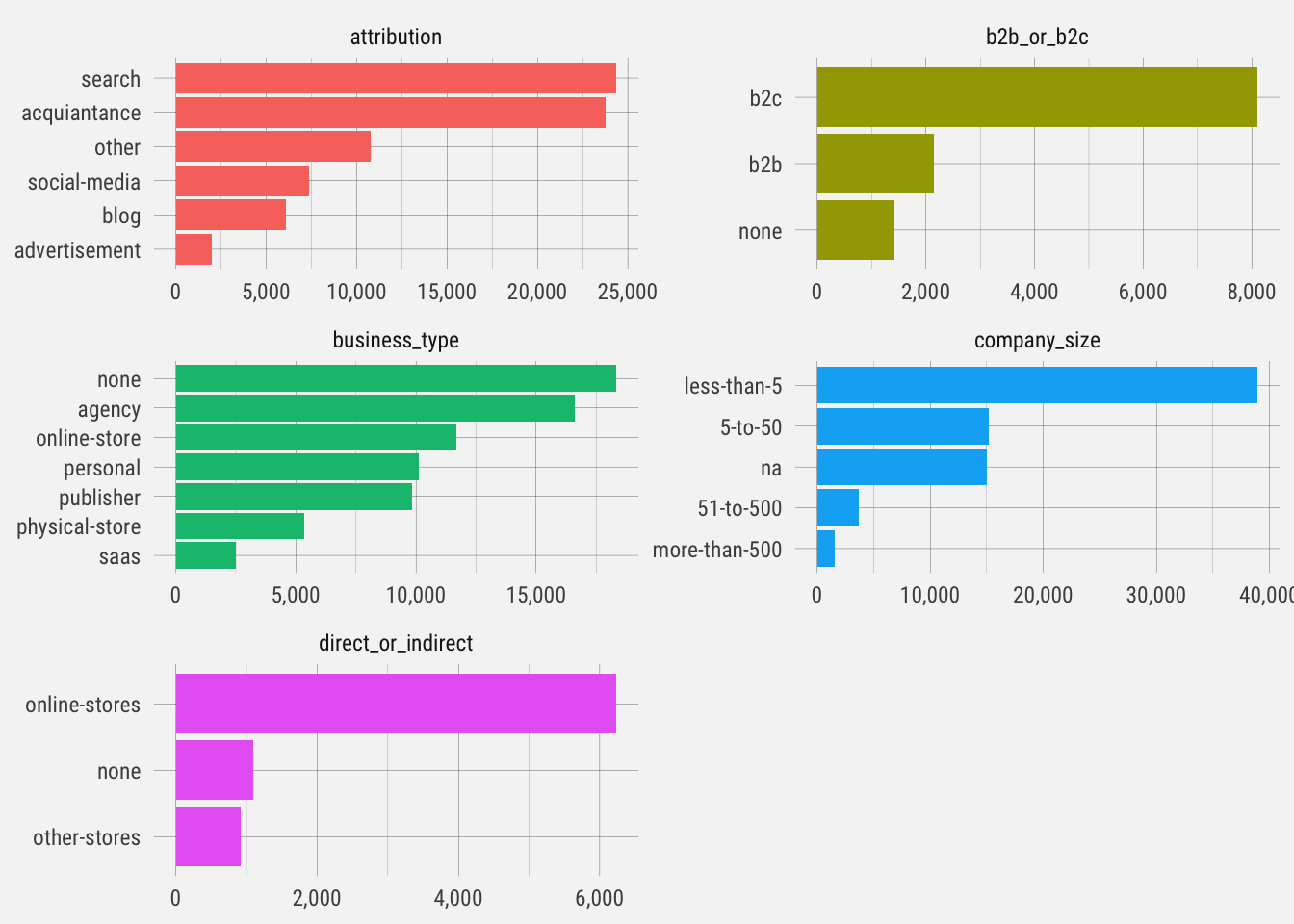
These are interesting distributions. Notice the different scales on each graph. This gives us an idea of the type of user signing up for Publish. Let’s see how likely they are to start trials.
## `summarise()` regrouping output by 'question', 'answer' (override with `.groups` argument)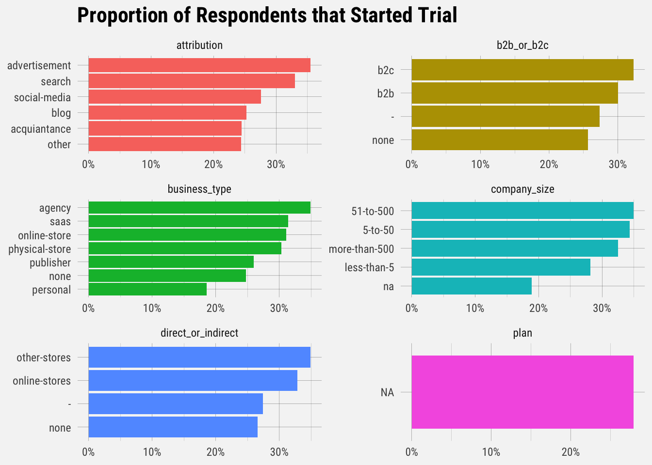
Interesting results. Let’s look at the proportion of users that actually upgraded.
## `summarise()` regrouping output by 'question', 'answer' (override with `.groups` argument)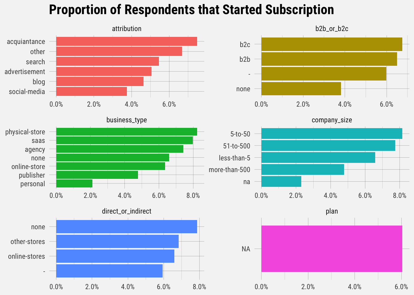
It looks like B2C businesses, physical stores, companies with 5-10 employees, online-first stores, and those who heard of Buffer through an acquaintance upgrade at the highest rates.
Now let’s plot the percentage of signups that are target customers.
## `summarise()` regrouping output by 'week' (override with `.groups` argument)## `geom_smooth()` using formula 'y ~ x'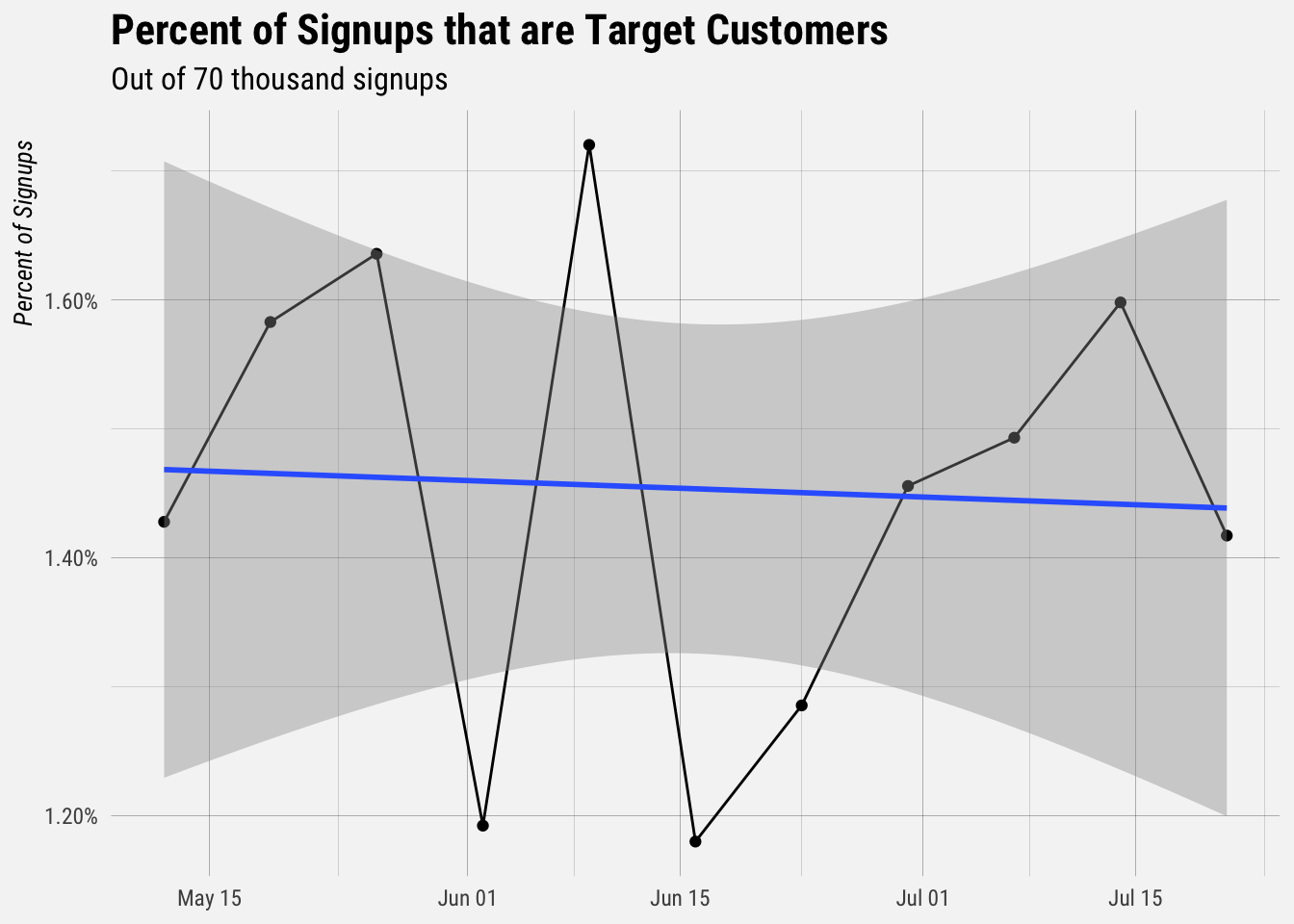
Less than 2% of new signups fit our target customer criteria. Now let’s plot the upgrade rates for different types of each category. Let’s start with the is_target_customer field.
## `summarise()` regrouping output by 'is_target_customer' (override with `.groups` argument)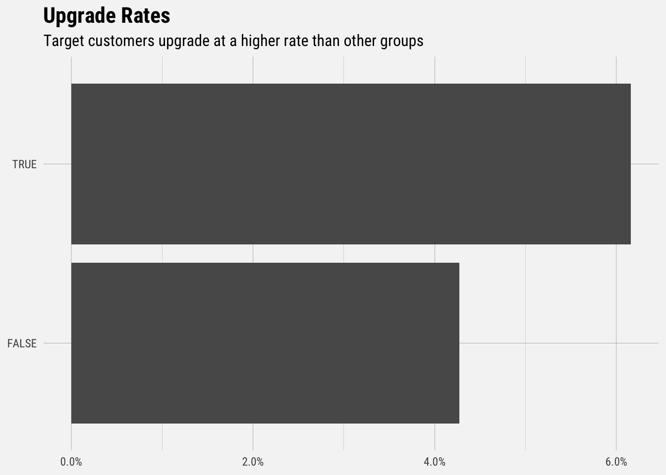
Users that fit our target customer criteria (B2B online direct-to-consumer store with less than 500 employees) upgrade at a rate of around 6.2%. Non taret customers upgrade at a rate around 4.2%
Logistic Regression
Let’s fit a logistic regression model to get an idea of which responses are correlated with the probability of upgrading.
library(broom)

# change column types to factors
factor_cols <- c("attribution", "b2b_or_b2c", "business_type", "direct_or_indirect", "company_size")
users[factor_cols] <- lapply(users[factor_cols], as.factor)

# plot model output
users %>%
  mutate(attribution = fct_relevel(attribution, "other"),
         business_type = fct_relevel(business_type, "none"),
         b2b_or_b2c = fct_relevel(b2b_or_b2c, "-"),
         direct_or_indirect = fct_relevel(direct_or_indirect, "-"),
         company_size = fct_relevel(company_size, "na")) %>%
  glm(upgraded ~ attribution + b2b_or_b2c + business_type + direct_or_indirect + company_size,
      family = "binomial",
      data = .)  %>%
  tidy(conf.int = TRUE) %>%
  filter(term != "(Intercept)" & p.value < 0.1) %>%
  mutate(term = str_replace(term, "company_size", "Size: "),
         term = str_replace(term, "business_type", "Type: "),
         term = str_replace(term, "attribution", "Attribution: "),
         term = fct_reorder(term, estimate)) %>%
  ggplot(aes(x = estimate, y = term)) +
  geom_point() +
  geom_errorbarh(aes(xmin = conf.low, xmax = conf.high)) +
  labs(x = "estimate",
       y = NULL,
       title = "Logistic Regression Coefficients",
       subtitle = "Company size indicates higher probability of upgrading.")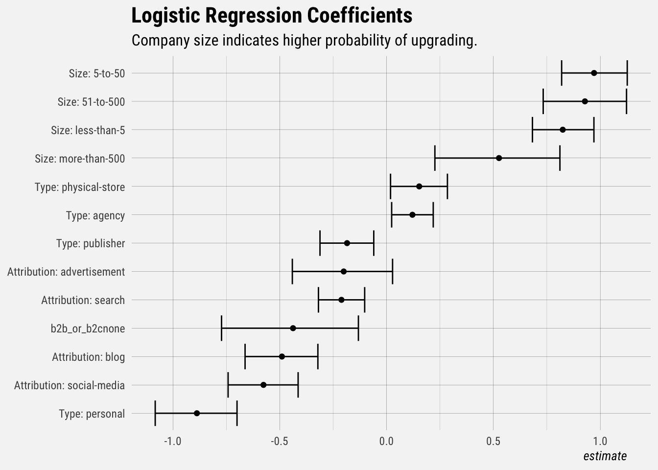
This plot shows the coefficients (and confidence intervals) of the model. Only the statistically significant effects are included in this plot. Notice that the confidence intervals generally do not overlap with 0. Users with a company size of 0-50 employees have a higher probability of upgrading, and users with a personal company and those that heard of Buffer through social media are less likely to upgrade.
Let’s update the regression model to only include attribution and company size.
# set factor levels
users <- users %>%
  mutate(attribution = fct_relevel(attribution, "other"),
         company_size = fct_relevel(company_size, "na"))

# fit model
mod <- glm(upgraded ~ attribution + company_size + business_type, family = "binomial", data = users)

# summarize model
summary(mod)
##
## Call:
## glm(formula = upgraded ~ attribution + company_size + business_type,
## family = "binomial", data = users)
##
## Deviance Residuals:
## Min 1Q Median 3Q Max
## -0.4133 -0.3582 -0.3155 -0.2337 3.1805
##
## Coefficients: (1 not defined because of singularities)
## Estimate Std. Error z value Pr(>|z|)
## (Intercept) -3.48235 0.11707 -29.745 < 2e-16 ***
## attribution- -6.61666 72.46303 -0.091 0.927246
## attributionacquiantance 0.03809 0.05313 0.717 0.473485
## attributionadvertisement -0.20104 0.11950 -1.682 0.092505 .
## attributionblog -0.48875 0.08684 -5.628 1.82e-08 ***
## attributionsearch -0.21104 0.05517 -3.825 0.000131 ***
## attributionsocial-media -0.57997 0.08352 -6.944 3.82e-12 ***
## company_size5-to-50 0.98004 0.07812 12.545 < 2e-16 ***
## company_size51-to-500 0.93706 0.09927 9.439 < 2e-16 ***
## company_sizeless-than-5 0.83452 0.07320 11.400 < 2e-16 ***
## company_sizemore-than-500 0.53306 0.14894 3.579 0.000345 ***
## business_typeagency 0.01549 0.09263 0.167 0.867167
## business_typenone -0.10456 0.09319 -1.122 0.261859
## business_typeonline-store -0.15675 0.09722 -1.612 0.106883
## business_typepersonal -0.98895 0.12727 -7.770 7.82e-15 ***
## business_typephysical-store 0.04707 0.10307 0.457 0.647926
## business_typepublisher -0.28993 0.10171 -2.850 0.004365 **
## business_typesaas NA NA NA NA
## ---
## Signif. codes: 0 '***' 0.001 '**' 0.01 '*' 0.05 '.' 0.1 ' ' 1
##
## (Dispersion parameter for binomial family taken to be 1)
##
## Null deviance: 26883 on 71479 degrees of freedom
## Residual deviance: 26132 on 71463 degrees of freedom
## (2950 observations deleted due to missingness)
## AIC: 26166
##
## Number of Fisher Scoring iterations: 8Now let’s quickly evaluate the model. Unlike linear regression with ordinary least squares estimation, there is no R2 statistic which explains the proportion of variance in the dependent variable that is explained by the predictors. However, there are a number of pseudo R2 metrics that could be of value. Most notable is McFadden’s R2, which is defined as 1−[ln(LM)/ln(L0)]where ln(LM)is the log likelihood value for the fitted model and ln(L0) is the log likelihood for the null model with only an intercept as a predictor. The measure ranges from 0 to just under 1, with values closer to zero indicating that the model has no predictive power.
library(pscl)
pR2(mod)
## fitting null model for pseudo-r2## llh llhNull G2 McFadden r2ML
## -1.306582e+04 -1.344132e+04 7.510037e+02 2.793637e-02 1.045149e-02
## r2CU
## 3.334266e-02McFadded is very low, around 0.028, indicating that this model has very little predictive power.