Data Collection and Tidying
library(DBI)
library(bigrquery)

# connect to bigquery
con <- dbConnect(
  bigrquery::bigquery(),
  project = "buffer-data",
  dataset = "dbt_buffer"
)

# define sql query
sql <- "
  select distinct
    u.id as user_id
    , date(u.created_at) as signup_date
    , s.id as subscription_id
    , s.plan_id
    , p.interval
    , date(s.created_at) as subscription_start
    , date(s.canceled_at) as subscription_end
    , s.status as subscription_status
    , min(i.created_at) as first_invoice_at
    , max(i.amount_due / 100.0) as max_mrr
  from publish_users u
  left join stripe_subscriptions s
    on u.stripe_customer_id = s.customer_id
  left join stripe_plans p
    on s.plan_id = p.id
  left join stripe_invoices i
    on s.customer_id = i.customer_id
    and i.created_at >= s.created_at
    and i.subscription_id = s.id
    and i.amount_due >= 1
    and i.paid
  where date(u.created_at) >= '2019-01-01'
  group by 1,2,3,4,5,6,7,8
"

# collect data
subs <- dbGetQuery(con, sql)

# add columns to data
subs <- subs %>%
  mutate(upgraded = !is.na(max_mrr),
         max_mrr = ifelse(interval == "year", max_mrr / 12, max_mrr),
         signup_week = floor_date(signup_date, unit = "weeks", week_start = 1),
         days_to_upgrade = as.numeric(as.Date(first_invoice_at) - signup_date))

# save data
saveRDS(subs, file = "mrr_by_cohort.rds")
Analyzing the Upgrade Rate
Let’s start by plotting the proportion of each cohort that upgraded to a paid plan.
## `summarise()` regrouping output by 'signup_week' (override with `.groups` argument)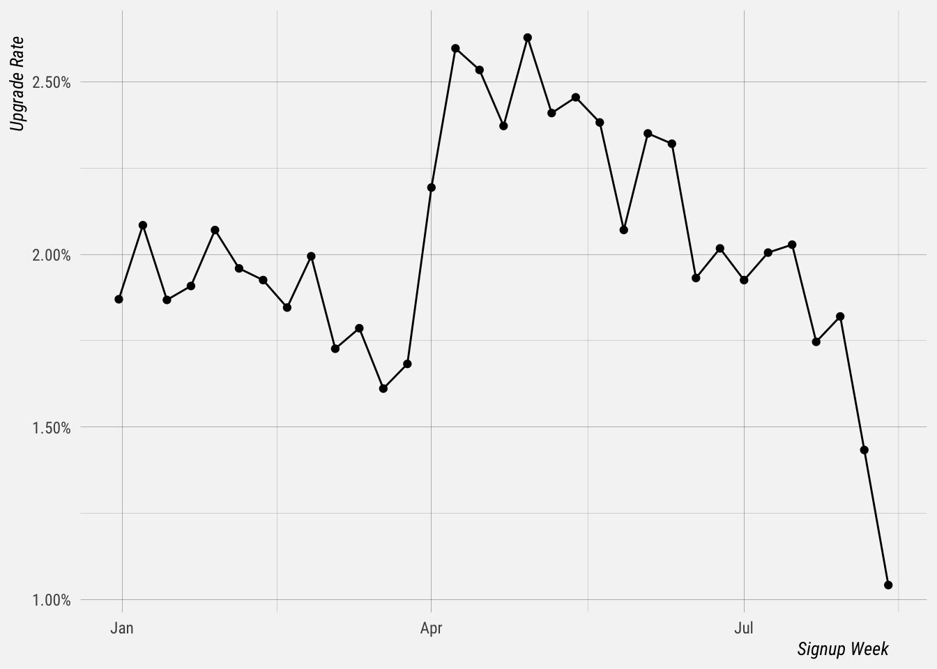
We see a clear drop in the upgrade rate for users that signed up in the past few weeks. That is because their trials either haven’t finished or have finished very recently. We need to allow time to pass to compare apples to apples. Let’s try to limit this to only look at users that upgraded within 14 days of signing up.
We only want to look at users that signed up before 14 days ago, which at the time of writing is August 9.
## `summarise()` regrouping output by 'signup_week' (override with `.groups` argument)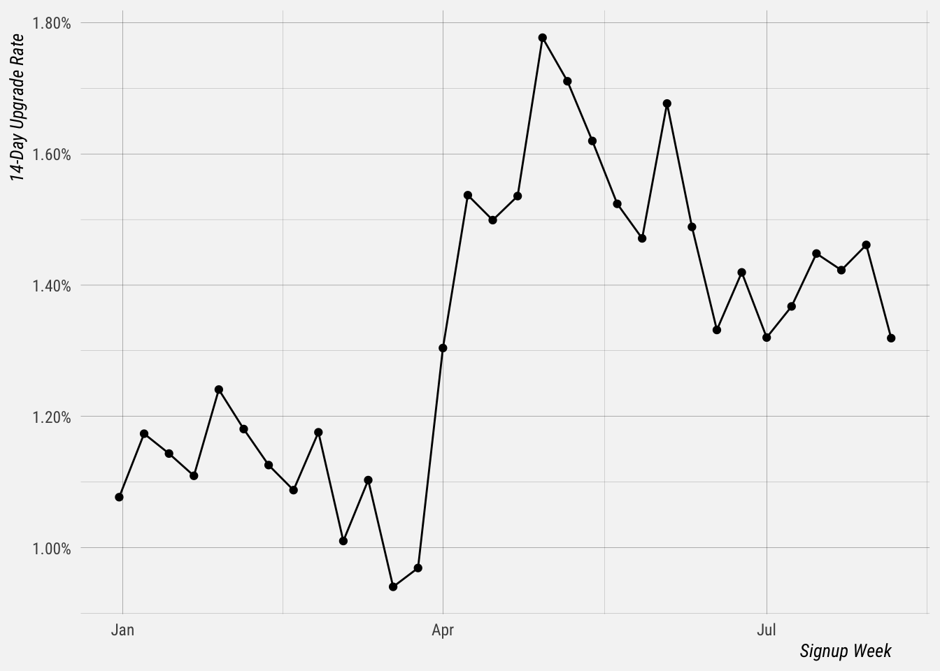
It looks like the 14-day upgrade rate has increased significantly since the beginning of April. Now let’s look at the proportion of each cohort that upgraded within 7 days of signing up.
## `summarise()` regrouping output by 'signup_week' (override with `.groups` argument)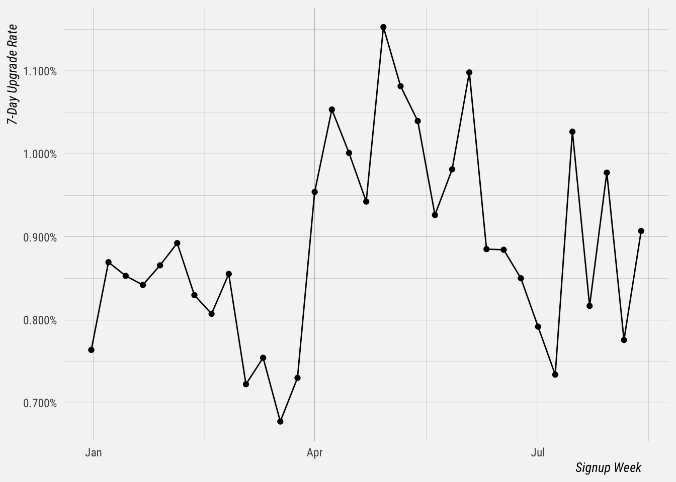
We can see that there is more volatility in this graph.
MRR by Cohort
Now let’s plot the revenue generated from each cohort. Again we see a tailing off that is due to trials not being finished.
## `summarise()` ungrouping output (override with `.groups` argument)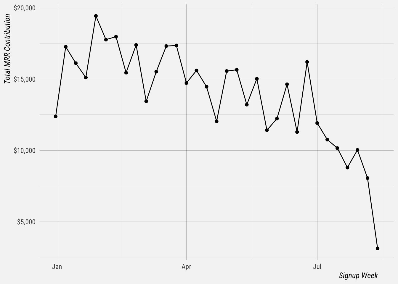
Now let’s plot the MRR that was generated by those that upgraded within 14 days of signing up.
## `summarise()` ungrouping output (override with `.groups` argument)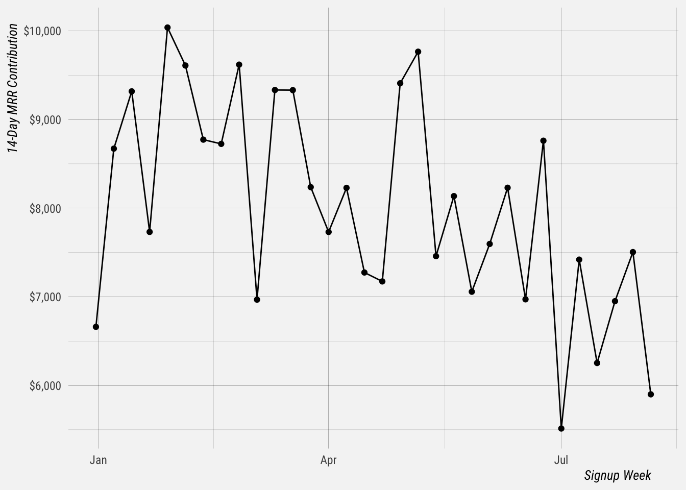
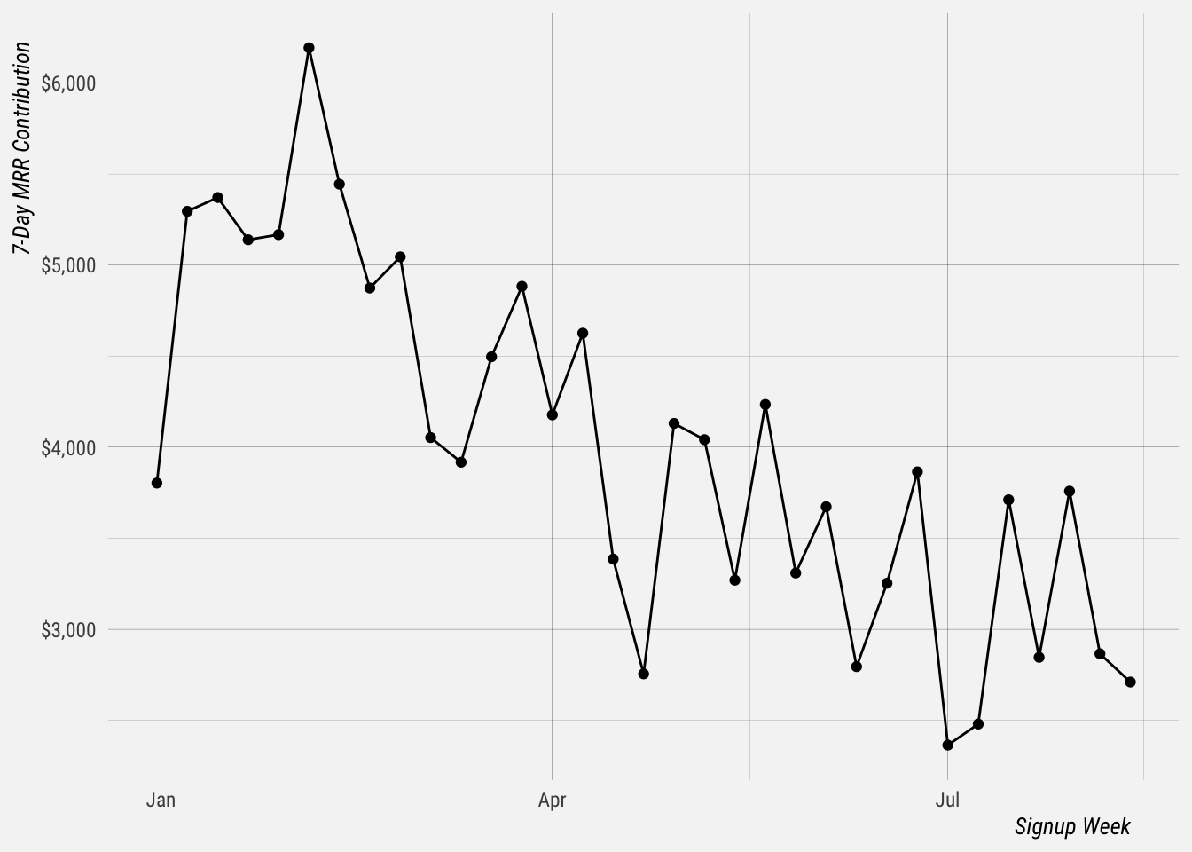
We see a slight decline here as well, up until recent weeks. MRR contributed within 7 days of signing up is also slightly down, but I suspect this is also due to the inability to upgrade directly.
## `summarise()` ungrouping output (override with `.groups` argument)