In this analysis we will examine some of the seasonal components of MRR. We will take a look at how MRR tends to change each month over the course of the year. We’ll include all Buffer MRR since the beginning of 2015 in this analysis. The data was collected from ChartMogul.
MRR Plots
Let’s start by plotting total MRR over time. The graph shows roughly linear growth until 2020 when the COVID-19 pandemic began to truly affect the business.
## `geom_smooth()` using formula 'y ~ x'
Seasonal Components with Prophet
Next we will examine the seasonal components of monthly MRR growth. We need to prepare a dataframe that has two columns, ds and y to use the prophet package for this analysis.
# create dataframe for prophet
prophet_df <- mrr %>%
  arrange(date) %>%
  mutate(growth = mrr - lag(mrr, 1)) %>%
  filter(!is.na(growth)) %>%
  select(date, growth) %>%
  rename(ds = date, y = growth)
Now we call the prophet function to fit the model. We specify that we want to include a yearly seasonal component.
# fit model
m <- prophet(prophet_df,
             weekly.seasonality = FALSE,
             yearly.seasonality = TRUE,
             algorithm = 'LBFGS')

# make future dataframe
future <- make_future_dataframe(m, periods = 90)

# create forecast for future dates
fcast <- predict(m, future)
Once the model is fitted we can plot the seasonal decomposition components.
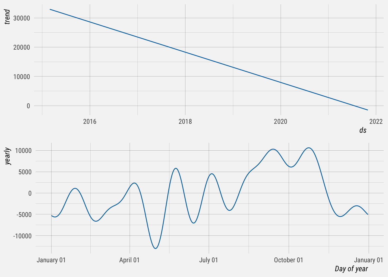
This plot shows us how MRR growth tends to change over the course of the year. This is based on approximately 5 years of MRR data. We can see that the general trend is downward after controlling for monthly fluctuations. The large dip around April-May can be explained by the substantial decrease in MRR due to the COVID-19 pandemic.
Seasonal Plots with Forecast Package
Now we’ll look at some interesting seasonal plots using functions in the forecast package. To do so we’ll first need to save our data as a time series ts() object.
Seasonal plots allow the underlying seasonal pattern to be seen more clearly, and is especially useful in identifying years in which the pattern changes. In this case we can see the impact of the pandemic in 2020 and the flat recovery.
# order mrr by date
mrr <- mrr %>% arrange(date)

# save as a time series object
ts <- ts(mrr$mrr, start = c(2015, 1), frequency = 12) 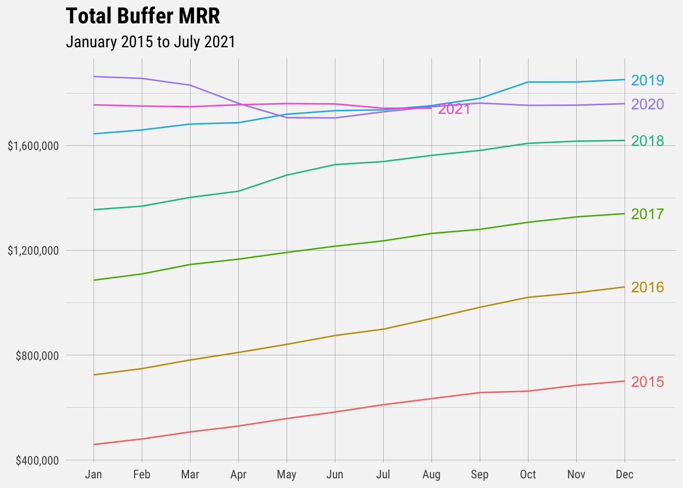
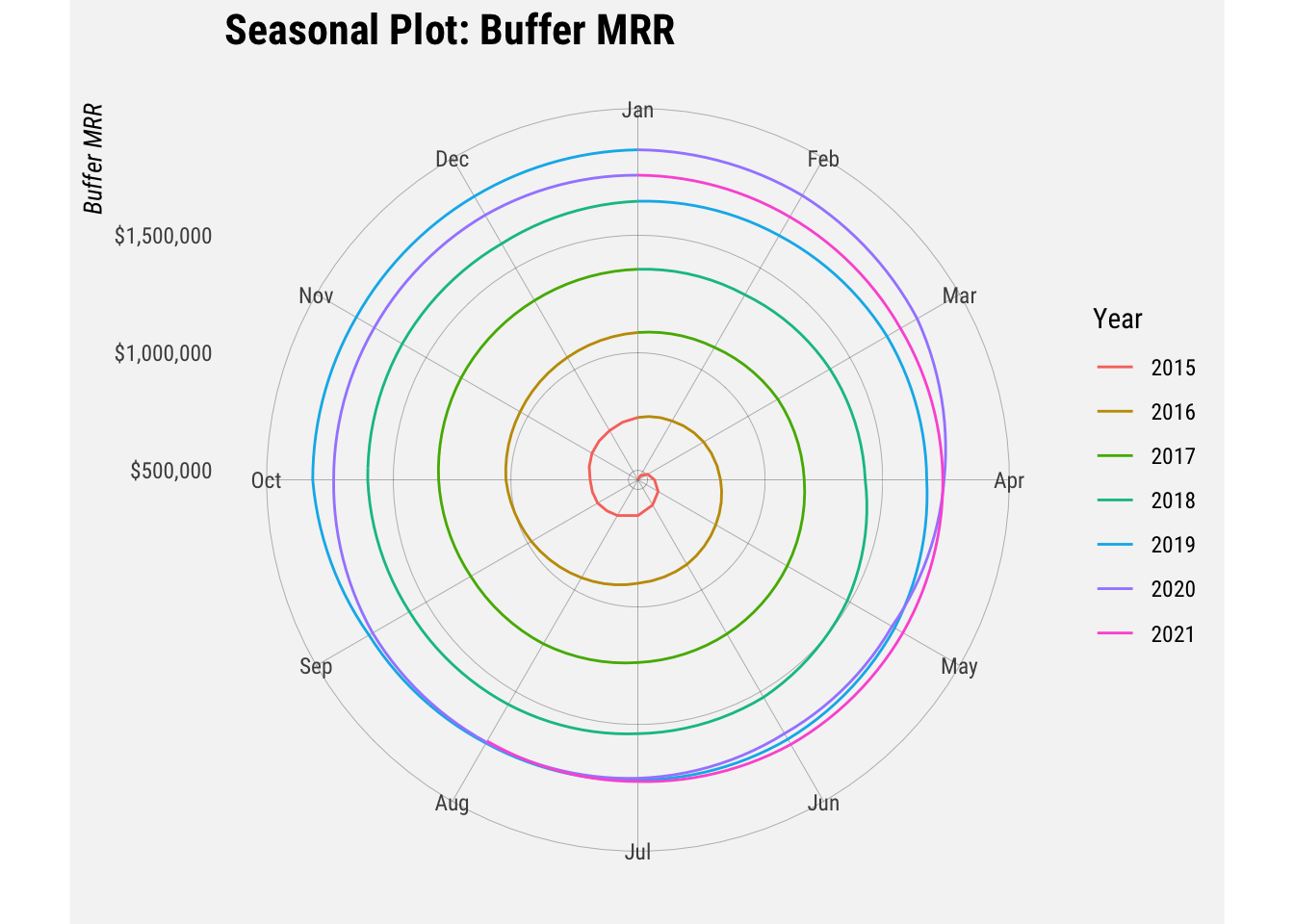
A useful variation on the seasonal plot uses polar coordinates. It doesn’t appear to helpful to us here though. Ideally the lines wouldn’t overlap.
An alternative plot that emphasises the seasonal patterns is where the data for each season are collected together in separate mini time plots. This shows how monthly growth has changed over time.
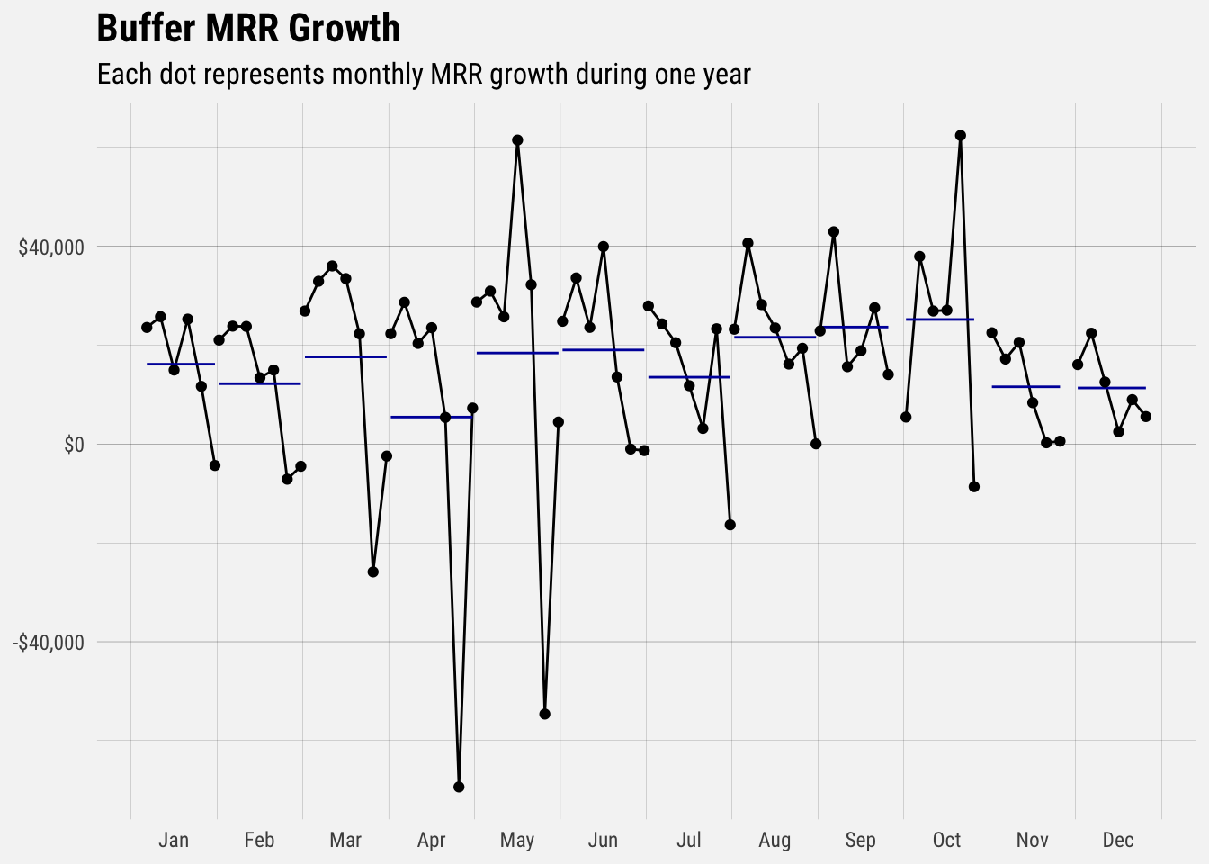
The horizontal lines indicate the means for each month. This form of plot enables the underlying seasonal pattern to be seen clearly, and also shows the changes in seasonality over time. We can see that monthly MRR growth has declined year over year for most months since the start of 2015.
This plot tells us that MRR growth has tended to be highest in October and lowest in April.
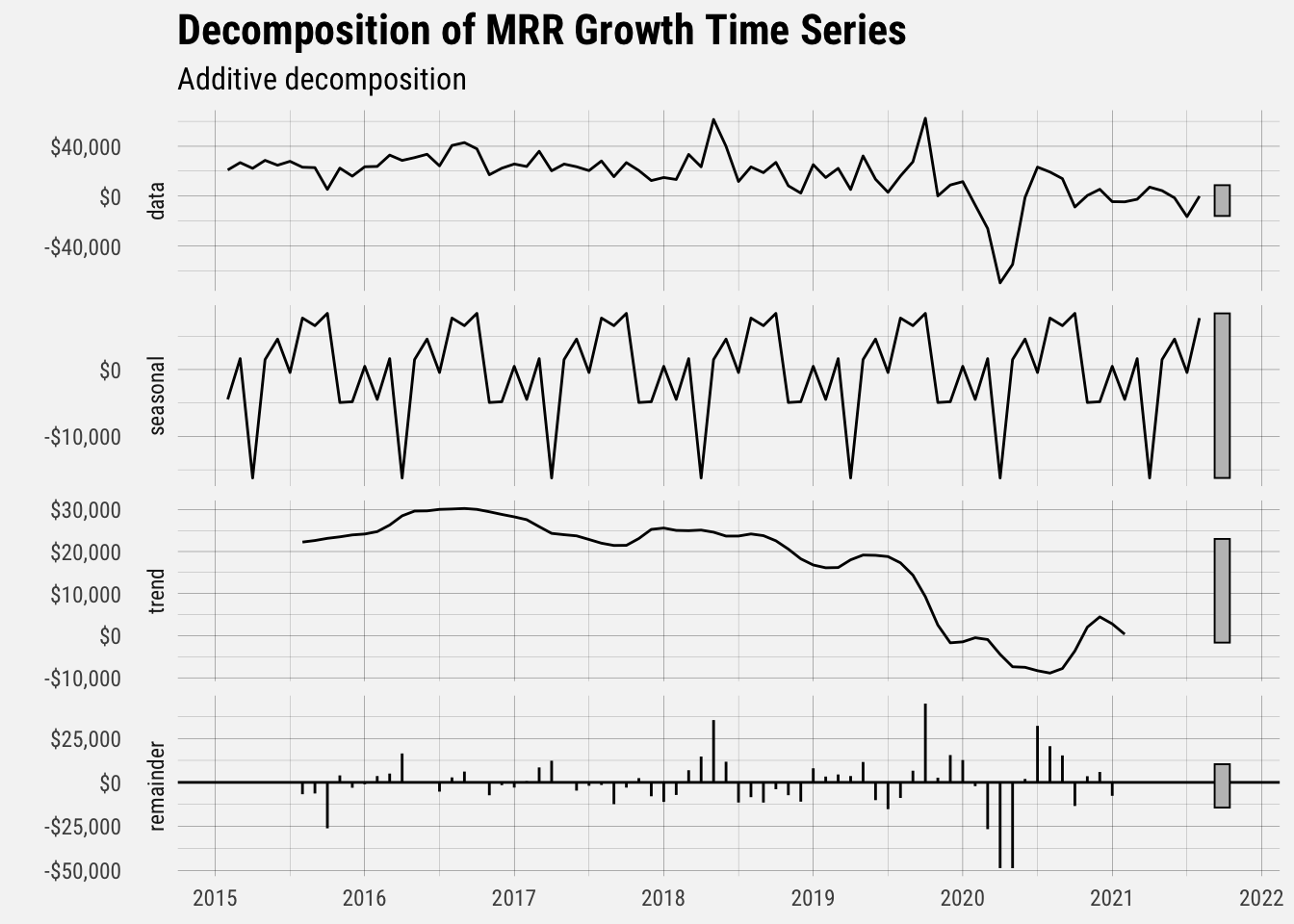
This decomposition graph shows us the trend in MRR growth and the monthly seasonal component. The remainder can be quite large, probably due to product changes that we’ve made that affect MRR growth. The seasonal component again indicates that MRR growth is highest in the spring, decreases in the summer and picks up in the fall before decreasing at the end of the year.